|
Reports
|
| Price: 1.49 EUR
(or an equivalent in your local currency) |
|
QS Store
Home
|
The Reports upgrade adds a functionality for report generating for QuantSense. The output
is a bunch of files: pictures, .css style and a web page, which can be viewed directly
in QuantSense, in any browser or it can be uploaded to your web site.
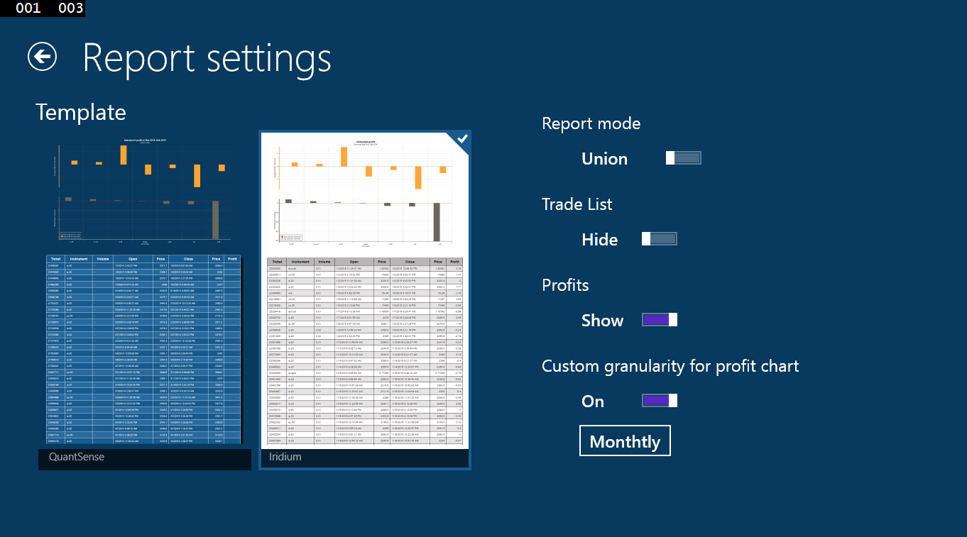
Reports can be customized in various ways. This is the Settings screen for a report:
Template
You can select how your report will look like. I have prepared two basic designs called
QuantSense and Iridium.
Report mode
Report mode can be switched from 'Union' to 'Compare' (and back). The standard way
how QuantSense works when computing any data is that it takes all your trades from all
your selected accounts and computes the data for all of them once. So you have one set
of statistics, one profit curve and so on. Mathematically speaking, it makes a union of
all trades from selected accounts.
The 'Compare' mode is an another cup of tea. In this mode QuantSense will treat all your
selected accounts separately. It means it will compute a set of statistics for every selected
account and show them in a table so that you can compare your results for every
selected account alone. Moreover, the profit charts will contain one curve for every
account. All of them will start at x=0 with first trade. The same is true for all other
charts shown in your report.
Trade list
By switching this switch from 'Hide' to 'Show' you can set QuantSense to hide or show
the list of trades in your report. Sometimes, one needs only to see some stats and charts
and a list of trades is just a noise in the report so here you can switch it off
when needed.
Profits
By switching from 'Show' to 'Hide' you ask QuantSense to hide your profits. This option
will not only hide profits of your trades, but volumes too and all the data and
stats from which your absolute profits can be estimated as well.
It is pointless to hide your profits only when
other people can see that your are trading 10 lots positions for example.
Even after hiding the profits there are enough data that show how good you have been
doing in the reported period. Simply try this option and see.
Custom granularity for profit chart
This is an option known for all owners of 'Stats progress charts' upgrade. By activating
this switch you can set custom time granularity in profit chart. With this setting off
QuantSense is showing the profit curve on per trade basis. If you want to see more
general view you can ask it to compute this curve monthly for example.
This option is usefull when comparing two trading bots trading on the same time period
but with different trading frequency. You just check how much is each bot earning monthly
and you get better overview of their performance.
Report examples
In the following links you can see some examples of reports generated by QuantSense with
various settings. The data used for reports in these examples are from simulations of
two trading strategies on EURUSD (named Strategy 1 and Strategy 2 in examples).
Strategy 2 is a slight
modification of Strategy 1 and reports in compare mode nicely compare both versions.
All three examples are generated from exactly the same sets of data (last year of simulations).
- Report in Iridium design, compare mode, profit chart in monthly granularity,
trade list hidden:
report
- Report in QuantSense design, compare mode, hidden profits, profit chart drawn per trade:
report
- Report in Iridium design, union mode, full trade list, profit chart drawn per trade:
report